Redesigning Crunchyroll
A redesign of the Crunchyroll app to improve content discoverability and search functionality.
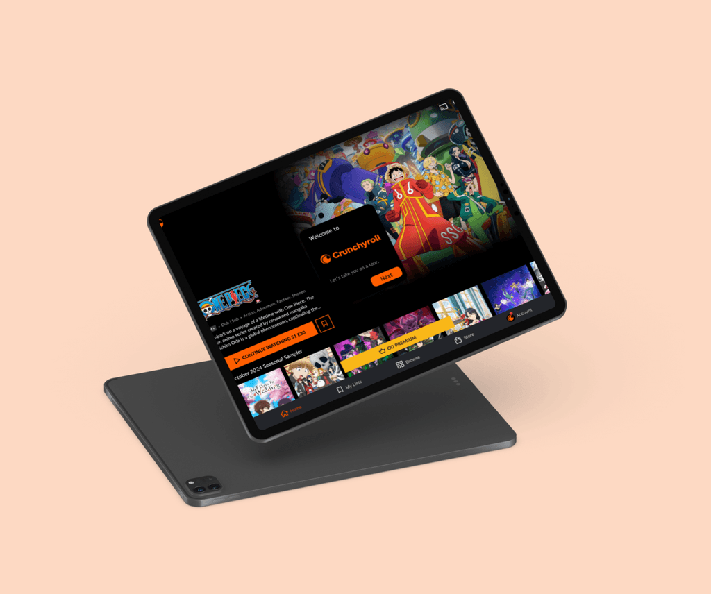
Project Overview
UI designer, UX researcher
Redesign the current UI of Crunchyroll to allow for easier content discoverability and provide filtering and browsing options to make a less cluttered search experience.
The Goal:
My Role:
Crunchyroll's current UI can make it difficult for users to discover new content and find specific shows, as the platform’s limited filtering and browsing options often result in a cluttered, less intuitive search experience.
The Context:
October 2024
Project Duration:
Project Overview
Crunchyroll is a popular streaming platform that offers a vast library of anime, manga, and Asian dramas for fans to enjoy. With a user-friendly interface, it makes accessing and exploring Japanese entertainment easy and enjoyable for both newcomers and longtime fans.
Introduction:
Preliminary research
Understanding the users
I performed interviews and digital ethnography to understand how users felt about the user interface of Crunchyroll, specifically about the ease of navigation and the general UI of the platform. Some of the main insights from this research include:
The preliminary research highlighted several key areas where Crunchyroll’s UI can be improved to enhance the overall user experience.
The organization system of Crunchyroll makes seasons of the same franchise harder to find.
The general app layout is unintuitive.
The home page is extremely cluttered, making it difficult to navigate.
The stylistic choices of the current UI make the app unable to stand out amongst other similar apps.
The search function is very hard to use, and offers no room for actual filtering,
Analyzing existing structure
Understanding the application
I explored the Crunchyroll app on a tablet to understand and sketch the layout of the interface.
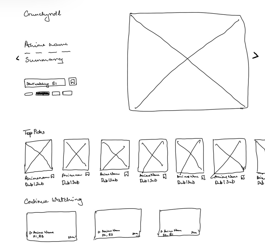
The app seems to be trying to push many anime recommendations on the home page, making it hard to navigate.
Content categories and recommendations are not well-organized, making it hard to navigate between personalized recommendations and genre specific anime.
Important information like anime summary, number of episodes and seasons, etc., is not visible unless the user visits the anime specific page.
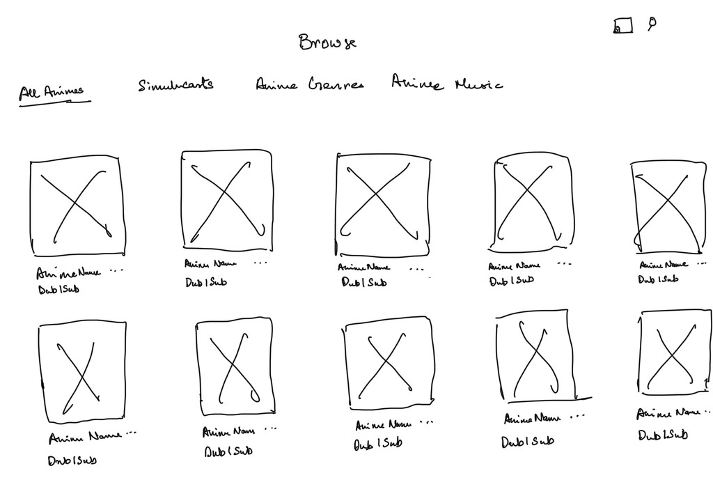
There are tabs that are very high-level and thus difficult to wade through.
The search function is pushed to the corner, and is easier to miss out on the bigger screens of tablets.
There are no filters in the search function.
Emphasizing functionalities
Brainstorming solutions
After spending some days using the app, I realized that a lot of the functionalities that people wanted to see in the app already existed, but they were simply unintuitive for users to find. Downloading the app on a new device with a new account revealed that there was no onboarding process that allowed users to get familiar with the app.
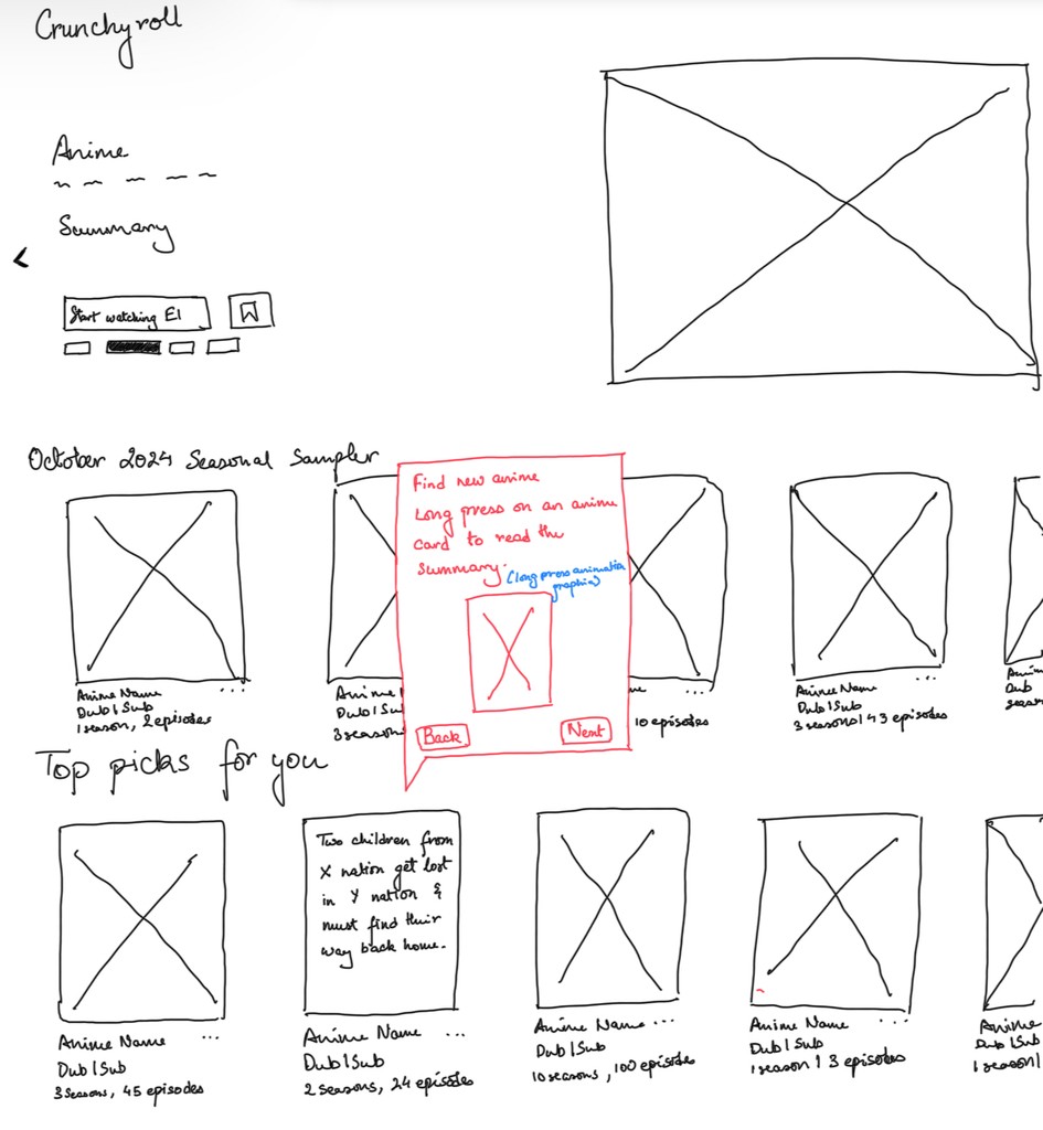
Adding simple onboarding tutorials would allow users to become aware of the existing functionalities.
Making the title cards in the carousel larger would improve visibility and larger spacing would reduce clutter on tablet screens.
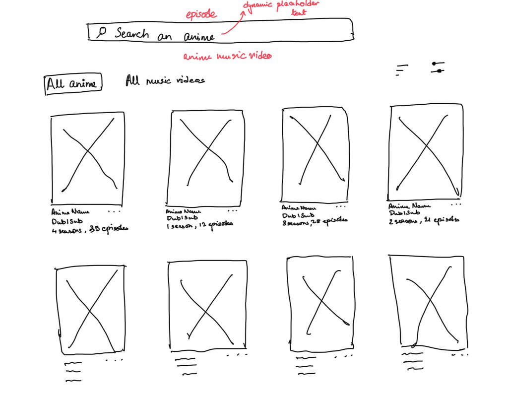
Moving all other tabs under the Filters would help reduce redundancy in categorization.
Making an search bar with dynamic placeholder text would prompt users to search for specific anime, episodes or music videos
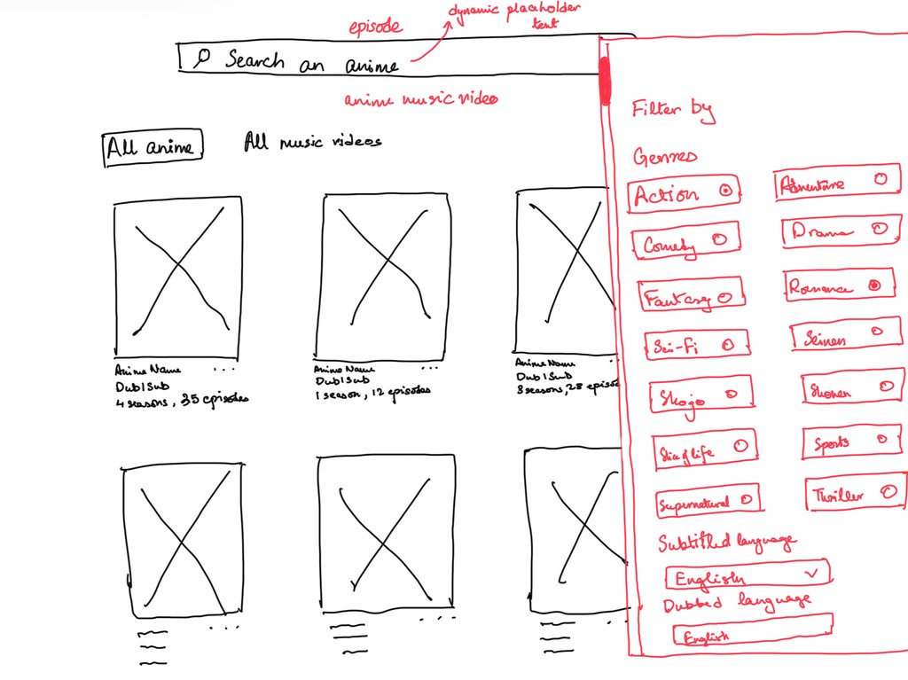
Adding detailed filters would allow for enhanced content discoverability and ease of use.
Reducing number of tabs to sift through would reduce users not feel fatigued during searching.
Prototyping
Final solution
I used Figma to come up with the final prototypes.
A mockup of an onboarding tutorial
A mockup of the browse section
Conclusion
My research highlighted that while Crunchyroll offers a range of features, the app’s usability is hampered by discoverability challenges that prevent users from easily accessing said features. Like my own experience with the app pointed out, these features are not made to stand out, thus going undiscovered by users who want to be able to use them. Addressing these design challenges would streamline interactions and empower users to fully engage with the platform, allowing for a more satisfying and user-centered experience.